| Phat1 gfx compo review
| Kreestaj / / skrew
Phat LOVE!
12 sunshiki ice'di / triumph 3372
Ice'di after "dragmoon" with cc01 disappointed. In "sunshiki"
see Standard Japanese girl anime, drawn even and smooth,
but still no modern frills. Again, such things as the lack of
background is very eye-catching ... Frankly, I still do not
fully understand this work, and what was on the flowers, I can
not understand. Ice'di, good luck!
11 hal9000 ralph 124c41 + / castor cracking group 3702
Um ... The only interesting for me in this work is its author.
Ralph 124c41 + / ccg - geee, cool name! The first time I heard
therefore silent.
10 tucnaci hannah / crazytronic 4012
Well done! Much heartier than "Vranov" with cc01! Technology on
the same level, and it is not important. So cute penguin! Cool
I like it.
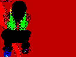
09 scr 22 marwin/k3l corp 4230
Marw, this old pixel-scenes are still here, still works
things! Happy fact. The picture is original, made in
style of the author. Red man on the screen, it must be some
kind of ghost, scary, but simpatishnoe ... Or
domupravitelnitsa, with a sense of asking: "My dear boy, what
do you think of what I have ear buzzing?".
08 at-at walkers berg 4577
Berg has already become a permanent member gfx compo at all the
parties in a row! Hammer guy. "At-at walkers" was done well and
I - like. Yes, the picture is not for the party, the plot does
not bear, but ... As I love little old 'Star Wars'! I remember
sebyamalenkogo, a great big movie screen and a solid wood seat
... Oh, there were times.
07 all done factor6/k3l corp / phantasy 4769
Muhahaha, Factor6 is great! The Question Concerning Technology
aside, but the very essence, the very idea! * Smile *
06 int 4 marwin/k3l corp 5319
Klevno! Honestly, I like it. Marwin, in my opinion, the first
guy participating in a composite with interlaced-image.
Interesting technique use these same two screens, I liked it.
05 phalling een love pharcide / nitrox 6323
The great thing! Weirdly beautiful, wild and technically awful
cute! Diver, in spite of the army, the best. IMHO, the first
place to com to anyone!
04 low phat1 pheel / phantasy 6469
Zdorovsko, I liked it. Worse than his work with kh01, but still
- PheeL is PheeL. Third place on the computer ..?
03 foto klown / delirium tremens / freedom 6491
KLOWN! Love! You're a hammer, a higher and higher you climb,
man. Great job, I really enjoyed it. Technique is not that
original, but it looks good, though not perfect. Itself Theme
drop dead! Hold on, man, we believe in you!
02 kore wa kireii desu jailbird / tempest / padua + bizk /
damage 6819
Cool! Really cool. But I do not quite understand how
You can stand in one component with different platforms, even
Taking into consideration similar 8-bit depth of both. At
commie because the colors easier! Not quite true. But the work
is excellent, such stylish person, very cool, I liked it.
01 future comes antipod 6835
Cool, although not the first place. Technique does not shine,
but not explicitly repellent. Notice of Alone in the Coder'a
kh01 was a picture with similar story, only made worse with the
technical side. R & I liked back then, but now I like
everything. Very nice work. But the place ... Fourth?
| Phatlogo compo
04 phatlogo ice'di / triumph 4227
Ice'di painted a pretty logo and a warm, touching. It is small
in size, and hence the time it spent little
little hard work. The result - the last place.
03 space logo berg 5319
Berg with the ugly, in my opinion, the logo has bypassed
Ice'di. Apparently, author has tried to depict the inscription
"phat1" as it were on the ball, but it turned out he had enough
left and just ugly. I note from the technical blunders
perebarschivanie "left" attributes, all subtlety with which
Berg did not catch.
02 phat ralph 124c41 + / castor cracking group 5933
Something terrible has depicted a guy with zabavnm name,
although in there is some magic! The first time I look at the
logo, I do not notice the whole left engineering, did not
notice anything at all - in my subconscious as something
incomprehensible pressing sense of beauty! Either I'm going
mind, or Ralph 124c41 + invested in the work of something
special, warm and alive. Although with his feelings to me to
understand difficult and very logo neodnaznachno ... Sometimes
it comes from some tough depressive mood!
01 phatalia relict/phantasy/k3l corp 6093
The best on the components of the logo in Relict'a, which in
recent times, at as I know, likes to draw just the logs.
"Phatalia" Timeout classy, very stylish and nice logo, but
without frills in Engineering and selection of perspective. If
I may say so, the net oldskool logo, a graphic treditsiyah
Terror / / DR. I note a rather Left background, but in any
case, even such a background is better than none at all. Relict
fellow, he does what he likes and I happy for him!
| Epilogue
Excellent Partee Phat, I love him! This time it was zdorovskim
gfx compo, although a bit small, could see foreign artists that
rarely happens in the Russian parties; PheeL, probably for the
love of his group Phantasy draw a picture, it is already happy;
Klown promptly bursts into prizes; Diver seksiparen painted
ferocity; Phat1 rocks!