| Nuo'tm gfx compo review
| Collection of opinions - Gas 1913
| Views - skreamer, Nik-O, Rivo, Noviset, Demiurge Ash


I was the third time trying to start this article, and all
catch myself thought that this was already said a hundred
times. So just remember that I usually am about the need for
that trying to do and let's get down to business. :)


Only two words about why Revue involves not only
artists ... Those who have helped me in writing this article
does not conceited and decided to tell the world how and what to

do, just having heard the views of artists and technicians, it
is obvious it will be interesting to know the opinion of those
who see the work under slightly different angle of view - not
as they were created, and how they look like. So there you go
...

1. 'U R Dun' by Gas January 13

It just so happened that begin to come to
themselves ... 1 st place - it's great, of course, but
There is one big BUT ... Conversion to component,
even the most modified - it is only
conversion. No more and no less. Whatever
high place she did not win, the joy she
does not work. If adopted by compo
part only conversion possible, I would glad that
made the best remix, BUT ... Great BUT does not disappear.
Any handdrawn picture better conversion and if the rules are not
changed in the next gfx compo, I will not take part. Conversion
not for the components and convertion compo - so, sorry, crap,
and I very ashamed that I once before nedoper.


The only thing I can say in my defense - the rules
I did not write, so do not accuse me of plagiarism. Conversion
is not prohibited and lack of originality of work stress is not
required.

With regard to the views of my work, they can be neatly divided
into two groups - those who were aware and those who did not
know that Work is not original. Lead opinion, I probably will
not. Here and so everything is clear.


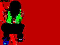
2. 'Conan' by Drawer / Entire 2

Difficult to understand how this miracle though
not quite poor creature climbed on 2
place.

Screamer> distinguished work and incomprehensible
place.

Perhaps the crucial role played by the fact about which he
wrote Surv! V0r in the latter Insanity, but perhaps all is not
the case.

Nik-O>-quality, well-painted warrior.

Noviset> strong image, very well-executed ...

It seems that work just simply liked people;) simply
Due to its simplicity, unloaded textures. For example, I
not thinking about ZSV, when put this work 8 points. Yes, we
have many shortcomings, but they might for someone to become
oldskul advantages.


Noviset> strong image, very well-executed ...

Of course, we have quite a few flaws, but they
able for someone to become virtues.

Demiurge Ash> crooked picture.

Rivo> splash image is reminiscent of the Spanish game average
quality, the picture painted nearly one in ink, without
color mixing, because of what it loses.

With all agree, but that if she loses on this. Or from
that if she loses. And if she loses at all:) Personally
I did not like the background because of too coarse texture
transitions. It seems the author just mastering this technique.
Probably not worth it her prebegat.


Noviset> though of course in my opinion an advantage in red
slightly spoils the work, and a little darker textures also make
work a little bit worse, but even so the impression of the
picture is quite horoshee and if not prideratsya to detail is
second place is quite deserved.


3. 'Kin Ship (Key La!)' By Surv! V0r 3

Opinions on this work can be safely
to sort the 2 files with names:

- MEGAgood.W
- 2muchRGB.W

The first file can be written as:

Screamer> Bravo, Surv! V0r! This is your best work! I do not
understand how can Survo upihivat many colors in the picture!
By the way, paintings Survo terribly packed! :)


Nik-O> Surv! V0r, you surprise me with their new work,
just class! Cannibal also shares my view.

In the second file would have gone Demiurge Ash and amateur
painter Rivo:


Demiurge Ash> violent colors of cutting my eyes are accustomed
to pastels. For paints lost the topic itself, the contours

peremeshivayutsya and creatures in the figure stomps and
sausage. It is felt, of course, a lot of work on a drawing, but
I irritates the latest fashion spektrumistov at the top of the
figure put work on color transitions.


Rivo> Like the other works of this artist, kinship
overloaded with details and colors, unfortunately not be traced
even links the name with the contents of the picture, I'm not
talking about some sort of plot or interesting way, and the
designs. In leet results it in the first place, as it seems to
me due to some confusion in front of voters in such

the pressure of color transitions, rather than image quality in
whole.

Opinion editor IZHNEWS would cut, but I do not
began to do this for the simple reason that it is in general
found the golden mean, in my opinion. Because really,
Everything has its positive and negative sides and not worth
to rush to extremes.

Noviset> That's really really so colorful and diverse draws
probably only Surv! v0r, so the name of the author of many
longer was it a secret during the voting, and even renaming

Work in my opinion is not knocked off the true trail voting.
Variegation pixel'ey and attributes very much distinguishes this
work among all the others. In terms of quality and
technical performance of the work is done at 100%, but
excessive variegation and realistic results makes
difficult to quickly understand, making peer into the details
and think a little about what is depicted on the screenshot,
that principle the pretty cool. Good work one and I would put it

above U R DUN.

The last sentence ... How do I delete it ... :)

But I am in general agreement. And pROF basically deserved more
high places, but more on that later ...


4. 'Kanopee' by kresstaj / skrew 4

It is difficult to comment on something ... Regular
conversion kris'a. Better than the ego
recent convert, but no more. In
anyway better than the ASCII art;)

Screamer> kreestaj again envelopes:))) In
Basically good, but something I have this
the picture is not particularly catchy. The feeling that she is
sick jaundice:) And so all is well.


Nik-O> a woman like me, and I'm pretty such I give it 8
points.

Rivo> course conversion (based on the orientation of the author
and some materials scream # 1), and under the attributes of the
written that the original was painted Moxia. Recalls his own
work "Sadness" with Forever2e3 SE - too bad the background
plasma, monochrome face, yellow, though present, but no

not properly mixed, that is what is not. Such
impression that soon kreestaj will draw chunks and then
simple attributes.

Demiurge Ash> Rubbish. Theft.

In general, all for nothing (except for the Nik-O) so sharply
reacted negatively about the work. Still, work has been done
and is not small. I also do not too impressed with this young
lady and in my opinion is all over blame the original! If kris
convertible Lion'a by Tyrant (in subsequently became UR Dun),
he could take a seat;) simply unfortunate choice of work:)


5. 'Beyond the mirror' by pROF/4D 5

Work pretty low priced
was voted most
positive recall in this review.
Perhaps I agree with Rivo:

Rivo> work much more interesting in
all respects than the previous ones. Because
it is similar to the original, as traced qualitatively, without
erratic patterns, there is nothing superfluous, and there is a
plot.

Indeed, the work is 100% original, as the author.
With regard to prorisovannosti, here I do not quite agree.
Superfluous really nothing, but something is missing.

Demiurge Ash> The idea is understandable, but the
implementation podkachala. If the artist had the perseverance
to hold on a drawing another week - add small details,
background, correct the last this terrible finger on the remote
...

As for the idea, it is not entirely original, and yet
the very existence of the plot are very happy. Unfortunately,
the presence of the storyline was not noticed by all, or at
least not immediately.


Nik-O> if not for Gas, I would not have understood the ideas in
this work. pROF, Your screen is original, well done.


Screamer> pROF progresses. Painting is not bad, although Lost
... I Like all the same anymore.


Rivo> interesting to hear and ponder, to capture
internal links and not notice anything extra. Perhaps I
would put her in first place, I do not know why it was not
appreciated leet-voted category, the impression that the
conversion valued above the plot and sensibility is not
appreciated at all, let alone technique is evaluated by the
number of colors multiplied by kolichetsvo details and
textures, no matter how justified their presence.


Perhaps in something here Rivo rights. Yes, this is now in
general Many say - we, the artists too much attention has been
paid give color and detail at a loss plot. However, despite

all of this, work Surv! v0r'a I would put above. In addition to
the plot should always be assessed and technology. If the work
is strong pROF'a plot, the work features a stunning combination
of Surv'a Flowers not seen previously in Speke.


6. '666 'By Falcon / Kingdom Dreams

Rivo> better than anything below 6 th place, but more to say
nothing.

Nik-O> conclusions of some dark and crock qualitatively drawn.

Demiurge Ash> hello Satanists, but this screen can prokanaet
only on the logo. And this skull I have somewhere seen:)

Well, in general have nothing to add. Says it all. Is that the
next work I would put above this.


7. 'Voodoo Men' by Psychotron

Screamer> this picture painted my friend Psychotron, which
lives a floor above me:))) Well what can I say ... In my
opinion not so bad.


Nik-O> dancing to the Indians, well, devil with them;)

Demiurge Ash> sm.heart, but there are at least attempted to
track build, but here the full disorder.


What can I say ... In my opinion, not all that bad. Sensitive
perseverance, and I have no doubt that we will have a new
competitor, although of course the statement Screamer'a scares:

Screamer> The picture was painted about two years ago ... She
only been brought to more or less manageable condition.

8. 'Freddy' by Sergio / Indigo

Nik-O> if not converted, it is still black and white pictures
on the party can be, imho, and not try to stand.


Demiurge Ash> scan-shit, though modified.

Indeed, b / w conversion on the component can be and not try to
exhibit.

10. 'Integrated' by Vox / ALC

Screamer> Now, a cool theme! Theme of truth has already beaten,
but still The same picture is not bad. Although the technique -
nothing special.

Rivo> In 1997, the Rom is much better to implement this idea in
picture "Azidream".

Nik-O> face sticking out of the boards - this is where
something was, well adverse reactions, this work does not cause
(vox, as a musician more not bad draws);


Demiurge Ash> The idea is not stolen by the first-ever, the more
execution lazhovoe.

12. 'Heart666' by Xavier / Eternal Champions

Screamer> something less, but ...

Nik-O/TL> I can not understand that it in itself is probably
heart attack ...

Demiurge Ash> someone learns to draw, so why put something
its a shame.


                       Epilogue.

Nik-O> Graphics examined. From this I have nothing unusual compo
did not expect everything I'm interested authors justify my
thereto respect, so that's it.


Rivo> Hard to say how much compo failed. I results
unsatisfactory, although it is very few people care about, so it
not a criterion. I have two suggestions in connection with the
arrangement places: either the voters were not many, or the
originality of today not in price. Both are sad.


Demiurge Ash> Just admit - to view the work I do not even
tried to find out later about the results of voting on
authorship of a work because of their general level
quite low.

In general, optimistic and does not smell, which of course are
not happy. In my sight component of success. It is only
necessary to draw conclusions from the mistakes and forward.
Another day another compo! :)