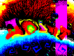
"Ss2004 gfx review"
by Diver/4D


Graphics were surprisingly scarce. I, as usual, waited about 20
jobs. Where were the Exocet, Hedgehog, Klown, Paracels, Gas
1913, Stanley, Deadie, Yerzmyey, Raynoa? Klown, apparently
upset by last year's disqualification of his megakartinki,
Paracels left Spectrum, As Gas in 1913, Stanley. Raynoa did not
have time due to the large number of works on Amiga / PC, but
the rest might catch something? In short, the works were few
and they were shown a time, instead of already usual then 2 (as
it was on CAFe). What was:


9 "nostalgy" by Tasman

Nostalgia for nostalgia, but pisishny font and konverchennaya
texture on the background of depressing. Did the author just
nostalgic for this?


8 "The Peaceful Submarine" by aGGreSSor / tPA

The same to me 72 meters, a pancake:) Many extra contours.
Author is learn from Kiri, painted "Vivat, Anarchy" on the
Millennium 2002. The style is the same or better for the
procedure.

7 "Alarm" by Moran / CPU

An alternative schedule is still alive. I wonder just how this
Drawn: pencil + scan or entirely on the zx? Although cool in
anyway.

6 "Gordian goes ZX" by Critikill / Farbrausch

Surprise that special, no one noticed. The picture was
drawn initially to the pc in the Spectrum resolution and
Critikill'om palette, and then Burn source and a little
corrected on the Spectrum of me. I do not know why, but the
result nobody was impressed, despite the uniqueness of having no

analogues in the past.

5 "Blood. The Last Vampire" by Diver/4D

The work is clearly not for the competition. It is foolish to
expect something to take with such work. Typical exclamation
man who saw the first time picture: "What is that garbage is
drawn?". Make rubbings with anime ungrateful, not the color on
the Spectrum, there is no half-tones, yes and stupid habit "to
do everything brighter and pokontrastnee" makes a great
wallpaper for pc in incomprehensible at first look at the mess
of Spectrum. But I'm still happy with the work. If not
component picture, albeit not a prize. I just sketched what he
wanted.

4 "Lacert" by Demonik / Ruins of Mankind

From a series of either conversion, or not. Thinking about the
conversion previous work suggests Demonik'a with @ toy2004,
though, honestly speaking, the textures look more handmade, as
well as attempts do color transitions on the face. In general,
progress.

3 "mushu" by Breeze / Fishbone crew

Conversion forever.

2 "Kidsoft" by Kacuk

WOW! If on the components had a lot of work, it would be
appropriate say: As soon as I saw this picture, I realized that
she will be in top3. And so, by themselves, and compete in
something no one had Cusick. Somehow reminds me of my own old
srisovku with photo "We Rules", only there are more people,
more smiles, emotions. And thus the picture is much more
spectacular. Cacique fellow.


A "Real" by Rion

Continuation of last year's pictures, from the unreal to real.
Beauty and the Beast (almost a monster), in the past year
iridescent scales, and now - steel mechanical handsome.
Again, remember the closest analogue of Rion'a - "Midway"
by Pheel, and all comparisons are not in favor of the current
"Winner." For already bored with the same texture here and there
impressive portrayal of a face and neck, the rest - no. Real
competitors in the colorful and effectiveness in the composite
is almost not there, far too childish to persons under boobs
and sports cars.


Outcome.

Progress seen among 3 authors: Kacuk, Demonik (no matter how
strange) well and Critikill. Lack of progress at: Rion, Breeze -
whether it is time to reflect and change something? Just not
pleased: Tasman, aGGreSSor. Not bad tradition upheld 2bit
graphics Moran.