Why?
by Schafft


In this article I will explain p_o_ch_e_m_u we have it going on.
Why such a shortage, lack of attention, and sometimes even
negative attitude? Oh yes, I did not say what I want to say ...
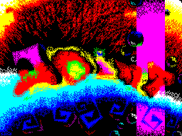
I talking about ascii-art'e on Spectrum'e.


The first thing that repels many beginners from ascii-art'a (I
talking about the new-school) - is the complexity of using
symbols. The second - is that after long labors of smoothing is
not acquire a satisfactory form. When I was looking at

Specchia New skulnye ascii, then to me they are the most
disliked - if the picture was supposed to be well smoothed, it
looked like worn over the years the paper on which attempted to
restore work of the artist. This was because the original of
this work was made on the PC. When I saw the work done on the
Speccy, then to me they were too naive, because they were mostly

label or logo, which was nothing but straight lines and
no bends. What is it to the dogs - art
when, after several hours of labor - can not get conceived?

Immediately after I got my PC - I realized what was happening, I
saw a significant difference and considerable comfort in
ascii-art'e. That's how I started this business because
it is very similar to the method of drawing pictures on the
Speccy, but in some places it is more convenient, but somewhere
on the contrary - is more difficult but these shortcomings do
not bother me.

And then and there was the question - "why?". Why does the PC so
possible, and a favorite ZX - impossible? What then is justice?
Although I saw that some people thing of this order is not

worried. I do not know, maybe it's because they have no such
love of order in chaos ... but it is not is not relevant.

And I realized why - the whole thing was a font. It was he who
prevented to portray their plan. But it was only my opinion
(yes, and now there is). And then I suffered a thought, but is
it possible to make the same font as the standard BIOS'ovsky on
PC? And why and no. And went to work - since I had a lot of

deal with ascii-art'om, I was pretty easy to find
desired characters. Although it was a lot of trouble with the
quantities some characters that had to be reconciled with their

filling in the matrix. Every time I looked at various pictures
ascii, that would achieve greater similarity. But after a not
very hours of work, I finished it. Not to say that he

exactly like the original (not a professional Asker
be difficult to find bugs), but it is as close to
BIOS'ovskomu.

We ought to tell you about its advantages over other fonts,
otherwise, my words are just allegations:

Characters have the most diverse amount - is what distinguishes
them from other fonts where they all almost the same size. And
once characters of various heights, it can be done right under
the various angle, as well as to make a smoother form of a
horizontal parts.


Now almost all the characters have a standard form - it's just
important as the first item. With all despite the fact that
even one and the same symbol can be used in different cases.
Well, For example, the symbol "4" - his oblique line can be
used to smoothing of the lines at a certain angle, and usually
the symbol depicted as "H" - where such a function is not
possible. As "4" for left and lower right corner gives us a way

smoothing of the lower roughness. Just enough to look at
ascii and you will see it (something I already tutor has
passed). These characters, which have different properties - a
lot, you look at other people's work and understand.


At the moment, the characters have different pixel-employment
matrix, which enriches the more shading in the asci. And he
became more standard. It also helps with smoothing in the
vertical lines.


I certainly do not insist on the use of all programs of this
font, but I recommend to where it is due to the ascii-art'om.
Now, for example, you can safely do their work in
ModernWorD'e. While talking about the editors themselves - it is
separate article.

Let him badly readable font, but it was not intended for
these goals, he has his opportunity.

That's why I said what I wanted. Spoke even a little bit about
the history of create a font and included in the article
mini-tutorial. Again, this is all just my personal opinion, it
is not necessarily coincide with yours. And I want to apologize
to all for a little experiment - that used in the first Gothiq'e

this font, as the principal.

/ / End


Why? part 2
by kejser_soze


I have long been wondering why the fact that we're all familiar
called Speccy scene there is no concept art scene.
most prejudicial "veterans" are discriminated against
concept in all the cracks, without giving a logical
explanation. gnya fingers and spitting poked in the ass, saying
"do not fuck us litas Need better go yes Murakami honor. "no
matter how disgusting realize that one of the highest
manifestations of art, such as creative writing spit on all
sides, cluttering minds of the classics of the genre, not
giving young talent to break through that is not good. look at
this picture close and a chill runs in the skin.


time would have to gather strength and make a solid member of
the art scene and on our favorite platform, because no obstacles

factors are almost gone. I do not understand why, in the
presence of a decent amount of Askerov and literature on the
Spectrum so far no one seriously engaged in production of art
packs (except skrju, naturally). WHY would asci-plyuyam on zx
not join in art team and not to please us, even
non-periodicity, its creations in one pack, because
astsi-artists are now not demand duly zx. this situation needs
to be correct. concepts as well rassprostronennye other

platforms, we are only in the face of several
representatives. how would things have changed for the better,
if instead nagryanuvshih Lamerzhi everyone would rush to write
literary packs, as many of the rooms in the authors feel the
writer's talent. nothing prevents them try their hand at a
higher level than the narrow obseranii.


Once they realized throughout the volume of the beauty of art
scene. skrju were a sort of Prometheus on the scene that have
made national property "Fire", or rather the art scene, or even
only a small sparks, which I hope will escalate in a giant
flame, which, in turn, will warm us in the coldest

second life. Here's what I wanted to say a little siey
exaggerated article.


 ksz

/ / Fin