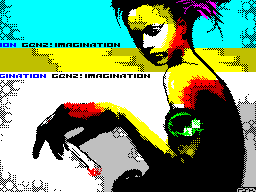
forever eight graphics works review
 riskej ■ simbols
 2007


stupid, no doubt, had to wait for a masterpiece, but for some
reason wanted to believe it. as in the case of music-compo,
forever eight there were no Russian scenery, in connection with
which it is managed and without masterpieces. strange
reflection: the feeling that I had already written off from the
accounts of Western artists. nothing? exactly nothing. baze,
cvm and trix can compete with the best Russian artists, but
this time baze simply not participated for whatever reasons,
cvm and trix could not impress me their creations. however, all
in order ...


11th place, kill by david, 275 points

seems, david decided not to surrender, the last two places on
forever 7 it is not confused. This time, unfortunately, again 2

last place, but it is clear that a person tries.
there is something mysterious in this work. implementation of
simpleton, but priyatnam understand just what makes a point on
the month, and red color slightly pustovato looks.


10th place, forever by david, 334 points

cute. teksturki too "thin", it was worth a little pochetche
outline the swans. Sunset in the pseudo-scanline does not look
very impressive. good work, through the romance.


09th place, melbabybeer by devandemar, 345 points

immoral kartinochka:) A child with a beer bottle. drawn and
baby, and cradle, and bells with a bottle of pretty good, but
very clear there is no background. rather, it was too
trite though he and blends well with the general idea.


08th place, pocasie by equinox, 381 points

for fun. funny girl for the cartoon. on the map except for all
things have settled down brand labels commodore 64. weak,
course work, but at least draw, and today it pleases.


07th place, monoskop by dusky/ci5, 393 points

Television, the eighth channel, which shows the Spectrum.
ideological, not more.


06th place, porsche 924 by factor6, 398 points

factor6, seem seriously interested in graphics, raww.orgy 2007
gave start, and now we see quite a good sequel. handdrawn

porsche, with a totally correct contours. wheel bit
crooked, and teksturki would not hurt to add some places, but in
Actually, a decent picture for a musician, a very worthy.


05th place, where's our forest? by tornado/ci5, 453 points

elk, fire, city in the distance. "Where is our forest?" very
ideologichna, but rather weak executed. teksturki sky made a
tool worth slightly refined, teksturki moon create a sense of
cereal, dirt, And the fire I liked very much so.


04th place, defenders! by hero / n-discovery, 461 points

the same style as the previous work "Jackass" with raww.orgy
2007 Once it became more fine details and teksturki places
become nicer.

The frame on the sides of spoils the impression, first
impression Fig. but otherwise not a bad drawing of riders and
horses flag and people away. anything above the horizon line
monochrome bored pustovato looks.


03rd place, love lust sex by k-os/raww arse, 464 points

and again k-0s, this time with the color works. style is
strikingly differs from the "evil genius", not for the better.
textures were primitive, face looks ploskovato lacks the
shadows. general, picture reminded of relict / pht, only the
latter still noticeably higher level of work.


02nd place, buble by trixs / mb-maniax, 545 points

y trixs, as well as on forever 7, again in second place with a
striking margin in points from the third, which, however, not
without reason. good job, even by modern standards. of what is

improve: the texture would be nice to put in order, to make them
"softer", yet they look like noise and shadow
objects / people should draw the more carefully.
color palette is very funny - a bright, even a little
redundancy, at times, casting a glance at the picture, all
fused and did not really find out what is holding the girl.


01st place, beauty archer by cvm / zeroteam, 563 points

by a small margin from the first-place lead cvm. last time
trixs beat him this time cvm took revenge.
work, in my opinion, turned out weaker than the previous
"fear", in largely due to the fact that now only one person
instead of 3 and drawing it is not the best quality. shadows on
the girl's face (From the movie, I think) looks a bit strange -

red across the forehead looks like War Paint at
Indians. bow, arrow, in general, everything except the face, it
is worth finalized. and it is not clear at all that on your
head - or cape hair?